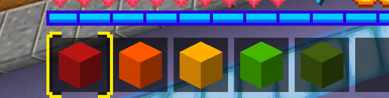
Just Build always had these old school icons for rating, however it isn’t convenient. Primarily to color blind people, these icons can be difficult to tell apart from each other.
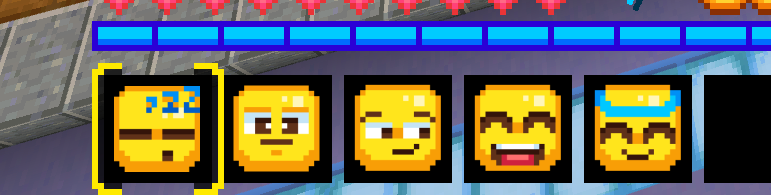
I think updating these icons to a more modern design can make it easier to tell apart from each other. Especially if they have variety, which I think in this case using the already established Emojis as new rating icons is a great fit.
This is the moment when the old looks really better (no offense)
But if there are people who like this style, then you can simply add a switch between the old and new style in the build battle settings.
12 Likes
True. I used Emojis as a concept example, not as what I want the icons to actually be.
1 Like
No, the point is that emoticons are a matter of taste.
3 Likes
They could just make their own icons similar to emoticons, but I see where the thought comes from.
2 Likes
I’m color blind, when I first started playing I just looked at the names of the blocks but not it is pretty self explanatory with the 1st one being the worst and the 5th the best
1 Like
You are color blind but like rubix cubes? I’m glad to see people still thriving.
2 Likes
Yes lol, honestly I wonder if it’s easier for people who see colors normal. I don’t see like complete black gray and white but I use a lot of “which color is lighter or darker”
2 Likes
The rating system has been overhauled in today’s Build Battle update, and builds are now rated from 1-5 stars.
https://updates.playhive.com/changelog/build-battle-quality-of-life-update
5 Likes