I recently noticed that the user icon frames are outdated and don’t match the hive style. Therefore, I propose my own version of the design.
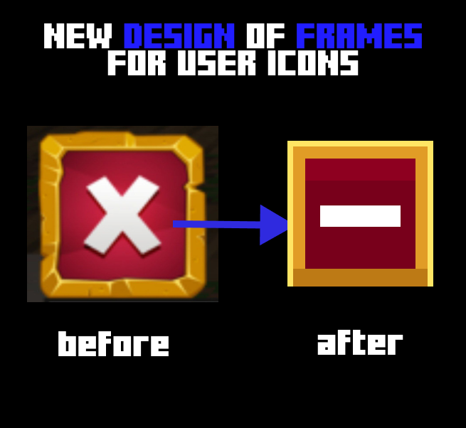
I hope it didn’t turn out so badly, and you’ll like it.
I recently noticed that the user icon frames are outdated and don’t match the hive style. Therefore, I propose my own version of the design.
I hope it didn’t turn out so badly, and you’ll like it.
Great art and representation!
I think the old style is more nostalgic and I believe it fits fine with the current state of the hive.
The proposed design by you (not to be a critic) looks a little too simple. I think it is good as it is.
I think the same over here. Good job with the art!