Hello!
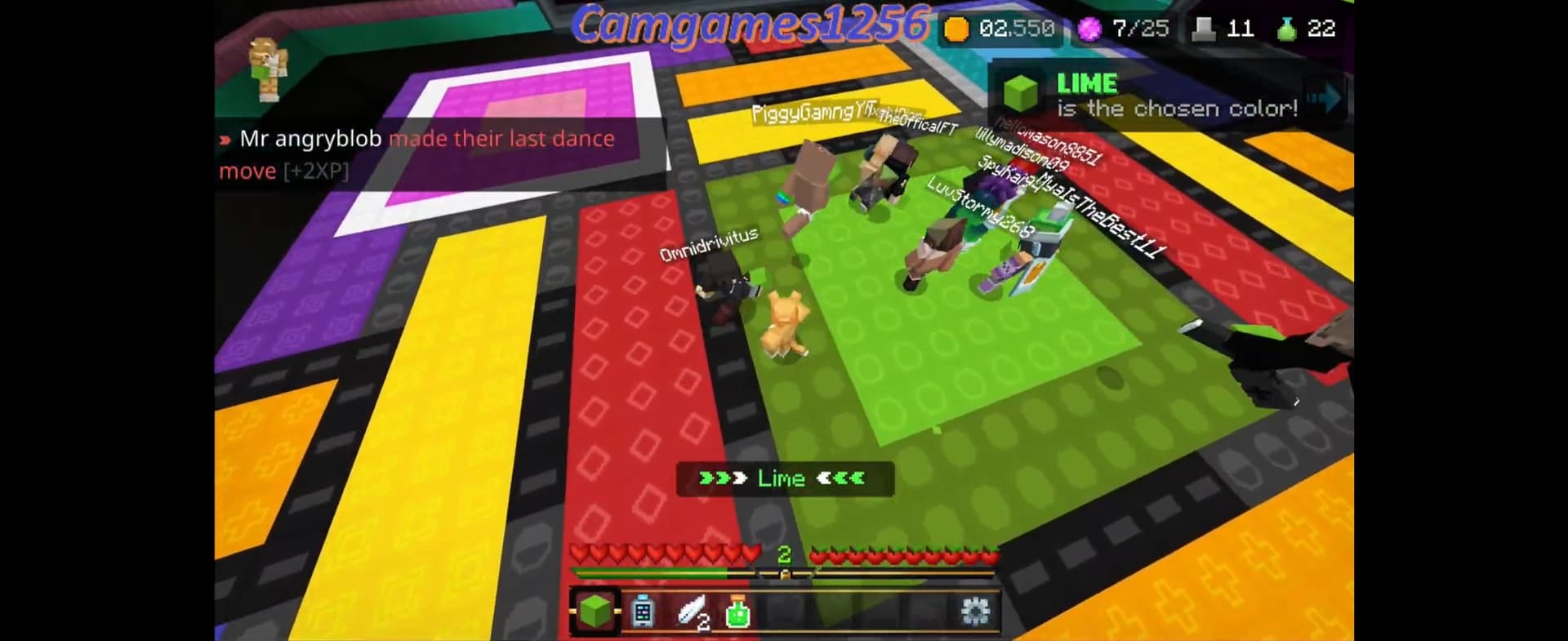
I noticed Block Party Colors are kind of hard to see.
For colorblind mode, instead of having the shape outlined on white, make it pop more by outlining it in back or have the user set the color
Hello!
I noticed Block Party Colors are kind of hard to see.
For colorblind mode, instead of having the shape outlined on white, make it pop more by outlining it in back or have the user set the color
This should be changed since, although i am not colorblind myself, if you’re colorblind it is still probably hard to see the outlines.
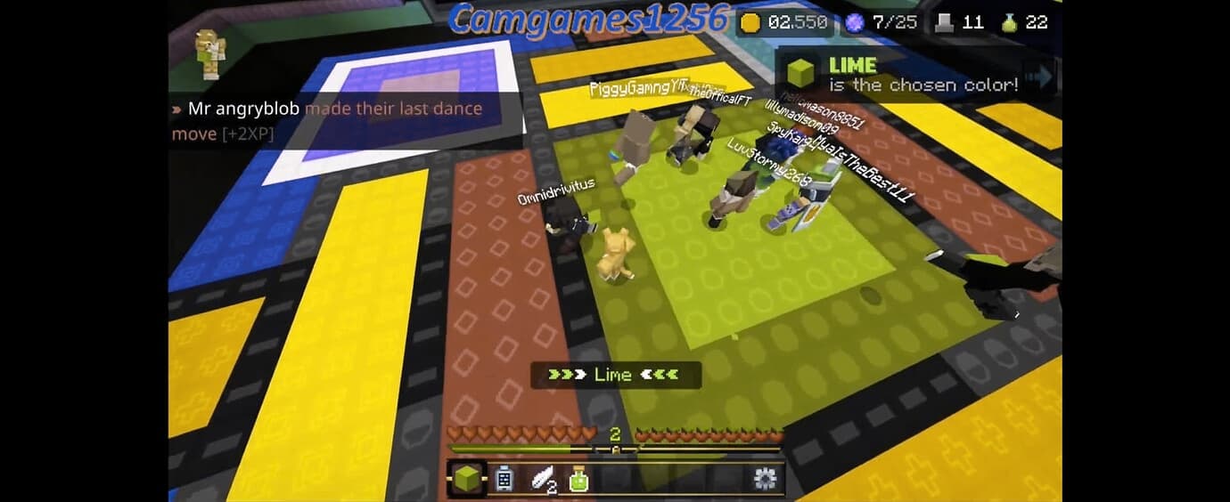
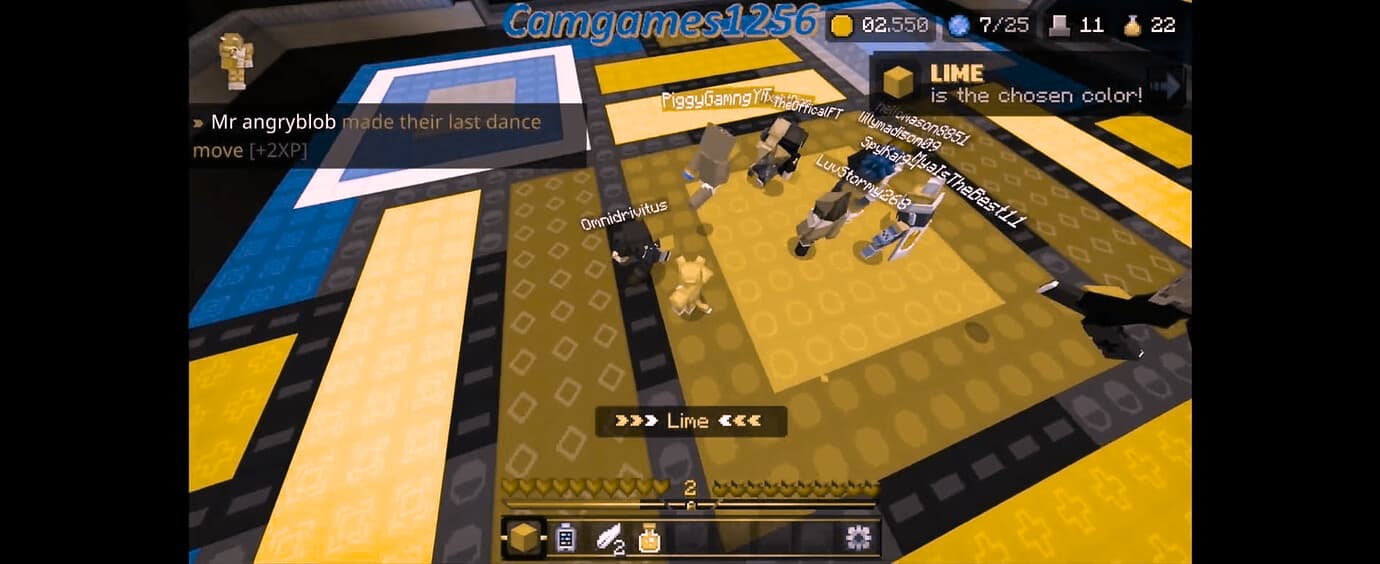
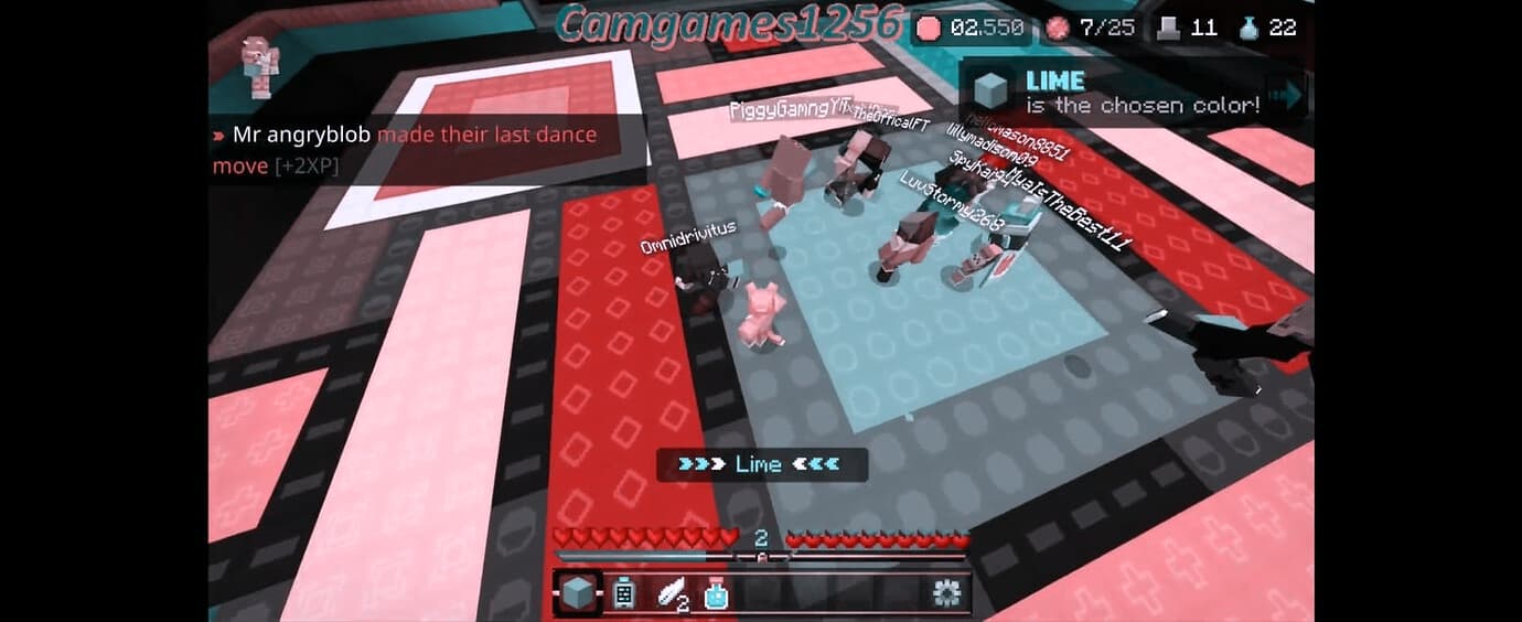
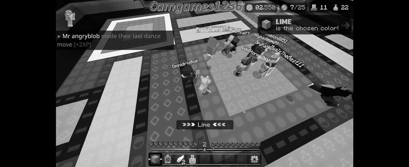
Ye, if I’m not mistaken lime and yellow look almost identical if you have red green colour blindness, and in that photo they barely even look like they have a sign on them.
An option to toggle black or white outlines could work really well in cb mode. Though these cannot be the same shade as the white or black blocks.
Yeah, the block party color blind mode is really bad
We appreciate your feedback, are you saying this as someone with color blindness?
I am partial colorblind to 2 colors. My friend is fully colorblind and unfortunately has a hard time playing
Just came back from the dead to say this But I think the Hive did colorblind mode really well! I would appreciate it if the patterns stood out a little bit more, but I can still really easily pick out the correct block from the patterns, allowing me to also enjoy block party. Could there be improvements? Sure, as I said, if the patterns stood out a little more, and if the saturation in blocks varied from the colors, that could be nice, but in the end, I think the Hive’s colorblind mode does the job really well! I have no complaints.
He says that he wishes the shape colors were customizable
one of my friends are colorblind and they had a lot of problems with the colorblind mode so a update is kinda needed
We’d really appreciate it if they could let us know what the specific issues they had were, it would be incredibly helpful ![]()
They had trouble knowing which was green or lime and I forget the others ![]()
as a colorblind person myself, i can totally agree on this. the outlines should be more brighter or at least more saturated.
After playing the game a lot more, and as a colourblind person also, sometimes the patterns sort of ‘melt’ into the colours, yellow’s pattern is especially hard for me to see.
You guys are true, this need to be improved.
(Hey Camgames, remember me? ![]() )
)
I’m not colorblind but i use colorblind mode anyway because sometimes it’s hard for me to differentiate certain colors (green and lime, pink and magenta, etc.)
I think this suggestion would be really cool actually, it would make it easier for people who actually are colorblind, since that’s the whole point of colorblind mode.
Yes I do the same ![]()
Super late to this! As someone who is colorblind myself, I agree in the sense that it is sort of difficult to see the white outlining of the shape, which really isn’t helpful in winning the game. This change you are suggesting would make the game more “accessible” (probably not the best word, but you get the idea) to people with colorblindness! (:
TLDR; yes I agree!
This change wouldn’t take much, all you would have to do it just increase the contrast between the outline and the actual block. I’m not colorblind, but even I have a hard time seeing the outline on the yellow block.