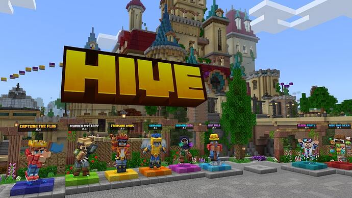
It was a classic but I don’t think that will fit in the new Hub
I also agree with @SmileyOnSpot
I think whey should at least make it so that you could properly stand on it. but I think they should bring it back because the new hub is soooooooo big it needs a bigger sign
look at how much room there is
there is soooo much room to put it
maybe make it bigger ![]() and less floaty
and less floaty ![]()
i miss the fact that everyone was able to take screenshots when they are in old sign, now it happens rarely and i wish it’s brought back
I’d rather Hive to concentrate on content than styff with the hub.
You may think the Hive sign is a staple of the server, but I only think a small but large minority acrually care about the sign.
The sign isnt that bad anyway. I thought it looked cool ![]()
BUMP!!
My huge problem is that it is an entity, which makes it disappear if you get too far away unlike the old one.
Hive needs to listen to their community more, the fact that this has been up for an over year and most likely has not been taken in to consideration is honestly just crazy.
Maybe there can be different servers, old and new hub, like as if they were different regions?
(EX: NA new hub, Asia Old hub, etc.)
If all else fails this would be a good option.
Am I the only one here with good taste
Fr though, I don’t see how you like literally just basic yellow concrete letters better than a model with multiple shades of yellows and oranges, depth, Minecraft style font, and actually looks like the Hive logo.
As for the most liked reply, I have some debunkin’ to do.
The devs can easily rotate the model to match its hitbox to fix this issue.
Again, things can be edited. If the community has a problem with this, the devs can just change the size and location.
![]() how it literally is the hive logo
how it literally is the hive logo
But again that’s just my opinion
Please do this the new hive sign makes me wanna get straight outa the hub lol
They can change it but it never feels the same. I have a suspicion that you never got really into hive until they switched the sign. And @zRvsey wasn’t trying to list fixable issues of the new sign, they were trying to list good parts of the old one. The concrete letters… feel better. That’s all, So much more like the hive we knew and loved way back when.

